
Two-Tone Kitchen Cabinets Done Right
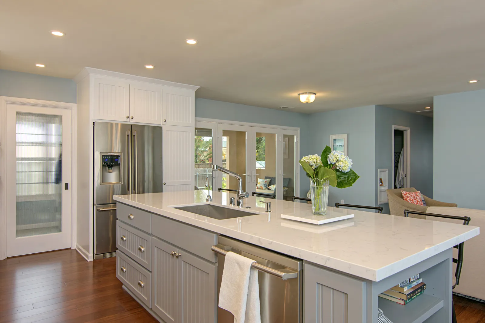
Scroll through any kitchen inspiration feed right now and you'll see the same move over and over: white or cream perimeter cabinets with a colored island, or light uppers over darker lowers. Two-tone kitchens are everywhere — and for good reason. Done well, the look adds depth that a single-color kitchen can't match.
Done carelessly, though, a two-tone kitchen reads as indecision. The difference between "custom" and "couldn't commit" comes down to a few rules we lean on in nearly every kitchen we design.
Anchor the dark color low
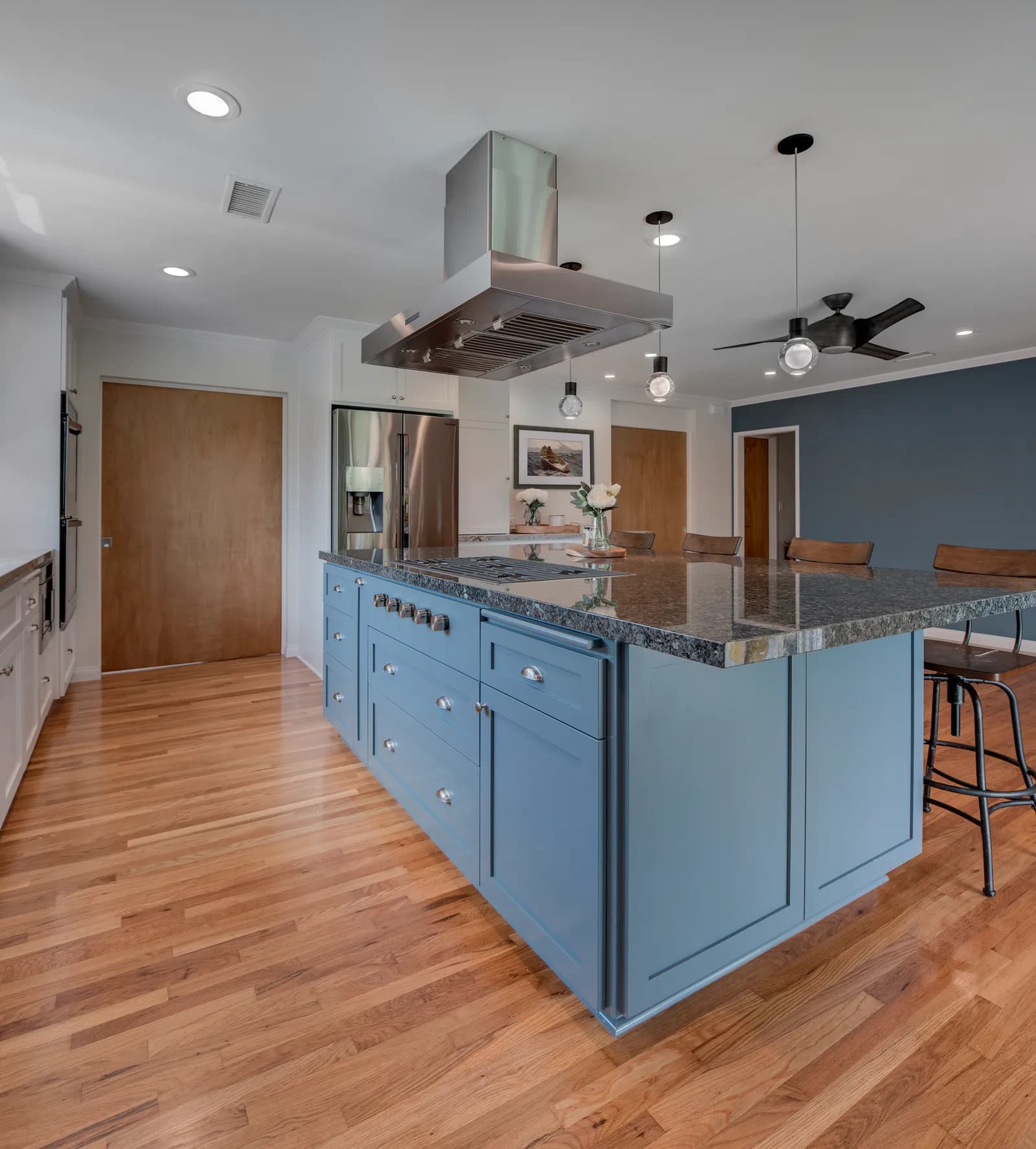
Rooms feel grounded when the visual weight sits near the floor. That's why the classic split — darker lowers or island, lighter uppers — almost always works, while the reverse rarely does. A navy, forest, or slate island under a light counter gives the eye a place to rest, and the lighter uppers keep the room feeling open. In San Diego's smaller midcentury ranch kitchens, where ceilings sit at eight feet, keeping the upper half light matters even more.
Let one color do most of the talking
The most common two-tone mistake is a 50/50 split. Aim for something closer to 70/30: one dominant color carrying the perimeter, one accent color on the island or a single wall of cabinetry. If you're pairing a color with white, the same logic we walked through in White Kitchens: Timeless or Trend? applies — white is the workhorse, the color is the personality.
Unify with hardware, counters, and floor
Two cabinet colors need connective tissue. A few ways to tie the room together:
- One hardware finish throughout. Mixing cabinet colors and metal finishes is where kitchens start to feel busy — we covered how to choose in our guide to picking finishes.
- One counter material, or two that clearly relate (same stone, different edge).
- Flooring that complements both colors rather than competing with either.
When the supporting cast matches, the two cabinet colors read as intentional contrast instead of a patchwork.
Test it in your actual light
This is the step homeowners skip. A blue that looks crisp in a showroom can go gray under our marine layer, and this month's May-gray mornings are actually a gift for testing: paint large sample boards and look at them at 8 AM under the overcast, then again in the clear afternoon sun. Coastal light in Point Loma behaves differently than the brighter inland light in Poway, and cabinet color is not a decision to make from a one-inch chip.
Built to outlast the trend
Here's the honest question to ask: will you still love this pairing in ten years? Muted, nature-based accent colors — deep blues, greens, warm woods — have stayed appealing for decades. High-contrast novelty combinations tend to date fast. In a full kitchen remodel, we design the two-tone scheme alongside lighting, counters, and layout so the color story supports the kitchen instead of carrying it.
Thinking about a kitchen with a little more personality? Request a consultation or give us a call — we'll help you land on a pairing you'll still be proud of a decade from now.
Design · Build · Integration
Let's build something beautiful.
Call (619) 334-3322 or request your free design-build consultation.